Alright, let’s cut to the chase—you’re trying to make a killer YouTube banner and you don’t want it to end up looking like a blurry potato, right? Same. I’ve been there, thinking I nailed the design only to upload it and… yikes. The logo is cropped, the text’s half missing, and my masterpiece looks like I made it on MS Paint circa 2003.
So if you’re asking, “What’s the ideal YouTube banner size?”—congrats, you’re already smarter than I was when I started. Let’s unpack the official dimensions, why they matter, and how to make your channel look like a pro designed it.
The Magic Number: YouTube Banner Size is 2560 x 1440 Pixels
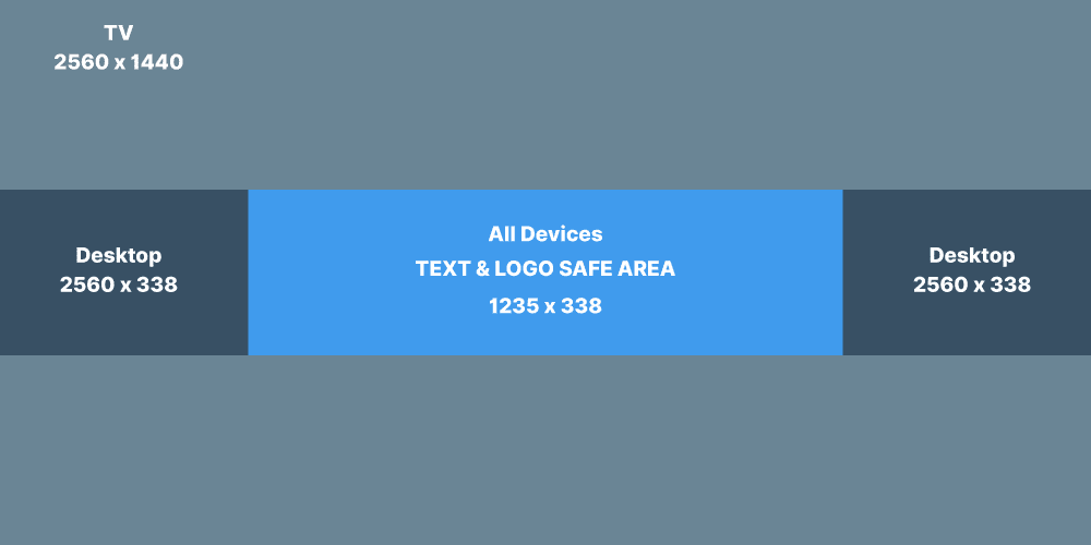
Let’s start with the cold hard number: 2560 pixels wide and 1440 pixels tall. That’s the full canvas size YouTube gives you for your channel art. But wait—don’t go opening Canva and slapping graphics edge to edge just yet.
Here’s why…
YouTube Banner Has Safe Zones
YouTube doesn’t show the full banner on every device. It crops and adjusts based on whether someone’s watching on a TV, desktop, tablet, or phone. You gotta design for all of them (cue dramatic music). Here’s what you really need to know:
- 2560 x 1440 px = full size (for TVs)
- 1546 x 423 px = the safe area (for phones and tablets)
- 1855 x 423 px = desktop view (slightly wider than mobile)
TL;DR: If it’s important (like your logo, tagline, or face), keep it inside the 1546 x 423 px safe zone smack dab in the middle.
Why the Safe Area Matters (Unless You Like Cropped-Off Text )
Ever seen a banner where the name is cut in half, or the graphics just barely make sense? Yeah, someone ignored the safe area. YouTube literally crops your design depending on the screen, and it doesn’t care if you spent 3 hours tweaking shadows and fonts.
So, what should go in the safe zone?
- Your channel name
- A tagline or upload schedule
- Your face or brand logo
- Any CTA like “Subscribe!” or “New videos weekly”
Design outside that zone if you want, but know it’s basically bonus flair for big screens. Don’t put your actual info there unless you like surprises.
Quick Recap: YouTube Banner Dimensions Cheat Sheet
Let’s simplify all those pixels into something your brain actually wants to remember.
| Device Type | Display Size Used | Visible Area |
|---|---|---|
| TV | 2560 x 1440 px | Full image |
| Desktop | 2560 x 423 px | Center + wide edges |
| Tablet | 1855 x 423 px | Slightly smaller center |
| Mobile | 1546 x 423 px | Just the center (safe zone) |
Pro tip: Stick a grid or overlay on your design with these zones. It’ll save you the “WHY is my face chopped off?” meltdown.
Best File Format and Size? Yup, That’s a Thing Too.
So now that you’ve got your size down, don’t ruin it by saving it in some potato-quality format. Let’s get nerdy (just a bit):
- File type: JPG or PNG (PNG is best for sharpness)
- Max file size: 6MB (yes, YouTube will complain if it’s too big)
- Color profile: sRGB (if you don’t know what that is, don’t worry—just stick with default)
FYI: If your banner looks weird or blurry after upload, it’s probably because you compressed it too hard or went rogue with file types.
How to Design a YouTube Banner (Without Crying Into Your Coffee)
Okay, so now that we’ve nailed the dimensions, let’s talk about actually making the thing. If you don’t want to deal with Photoshop and its soul-crushing learning curve, I’ve got good news.
Best Free Tools to Make a YouTube Banner
- Canva – Honestly, Canva is the GOAT. Tons of templates, drag-and-drop, zero stress.
- Adobe Express – Looks fancy, works great. Similar to Canva, but with Adobe flair.
- Snappa – Less popular, but super intuitive.
- Fotor / Pixlr – More like mini-Photoshop apps if you like tweaking images more precisely.
Bonus tip: Look for templates labeled “YouTube Channel Art” – they’ll already have the safe zone marked out.
What Makes a Good YouTube Banner?
A good banner doesn’t just fit the space—it tells your story in a blink. It’s like your channel’s handshake. If it’s too busy, too vague, or just plain ugly, people bounce. #HarshButTrue
Here’s what your banner should include:
- Clear branding (use your channel colors, logo, or consistent font)
- Your upload schedule (e.g., “New videos every Monday & Friday”)
- Social proof or a call-to-action (“Join 10K+ Subscribers” or “Don’t Miss Out!”)
- High-quality visuals (no pixelated memes from 2007, please)
You’ve got maybe two seconds to grab someone’s attention with that banner. Make it count.
Common Mistakes That Will Haunt You
Let’s save you from repeating my (and the internet’s) most common banner sins. Please… just don’t do these:
- Cramming too much info – Your banner isn’t a blog post. Chill.
- Ignoring mobile cropping – Remember the safe zone or suffer the cropping wrath.
- Low-res images – Blurry = unprofessional. Period.
- Over-the-top fonts – Comic Sans? In 2025? No. Just no.
- Bad color contrast – If your text blends into the background, what’s the point?
IMO: Keep it simple, bold, and crystal clear. That’s the trifecta.
My Personal Banner Fails (Yep, I’ve Got a Few)
So real talk—my first banner had EVERYTHING: gradients, five fonts, ten colors, and a galaxy background for no reason at all. It looked like a graphic design fever dream. I thought it was awesome. YouTube? Not so much.
Lesson learned: less is more, and understanding dimensions before you design saves you from heartbreak. Trust me, preview your banner on different devices before hitting “Publish.” The mobile version might surprise you (and not in a good way).
YouTube Banner Size for Mobile vs Desktop: The Real MVP is the Safe Zone
If there’s one thing you take from this entire rant—I mean article—it’s this: Design everything important inside the 1546 x 423 px safe zone.
You can go wild outside that area for big screens, but phones are where most people visit YouTube these days. Make sure your message, logo, and style hit home right there in the middle.
Tools to Test How Your Banner Looks Before Uploading
Want to preview how your banner will look on each device? You’ve got options.
- Canva + Safe Zone Guides – Already mentioned, but seriously: gold.
- YouTube Preview Template (PSD or PNG) – Just Google it. Tons of templates out there.
- Online Banner Previewers – Some design blogs offer free tools that show how your banner will appear on mobile, desktop, and TV.
Don’t wing it. Preview it. That’s the golden rule.
Final Thoughts: Mastering the YouTube Banner Size Like a Boss
YouTube’s banner system is basically a test of patience, precision, and not throwing your laptop out the window. But once you understand the dimensions, use the safe zone, and avoid the classic design fails, you’re golden.
Remember:
- Use 2560 x 1440 px for your canvas.
- Keep your vital stuff inside 1546 x 423 px.
- Preview your banner before uploading.
- Don’t make it look like a MySpace header from 2005.
And hey—if you’ve messed up before (like me), that just means you’re learning. Design is trial and error, and YouTube’s banner system is no exception.
Now go make that banner look amazing. And if you found this guide helpful, maybe bookmark it for later? Or send it to a friend who’s about to make the same mistakes we just helped you avoid.